Lockdown: Are Victory Declarations Premature in Battle Against COVID-19?

Prime Minister Narendra Modi announced a sudden 21-day countrywide lockdown on March 24. Since 21-day period has now been extended to a total of 40 days, till May 3, the Modi government is starting to tout the success of the lockdown in tackling the epidemic.
The Indian Express also carried an article which quoted scientists observing “a slight, but ‘noticeable’, flattening of the growth curve starting April 6.” Given the harsh costs imposed by the lockdown on the economy and people’s lives, the government clearly feels the need to justify the current lockdown and also its extension.
However, is there any solid evidence backing the Government’s bombastic claims that without the lockdown the number of cases would have been 8 lakh or even the more modest claims made by these scientists that there is a slight but noticeable flattening of the growth curve?
Let’s start by looking at the growth curve.
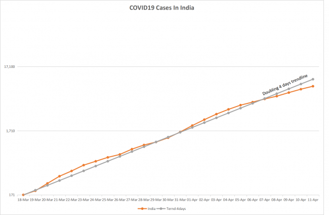
Scientists at Chennai’s Institute of Mathematical Sciences are claiming that starting April 6, there is a noticeable flattening of the growth curve. The above chart does show a dip from around April 6, but only time will tell, whether this is a trend which will continue to hold or it is just a temporary blip like the one we see from March 23 to March 30. To claim that this dip is due to the lockdown seems a bit far-fetched.
The lockdown officially came into effect from March 25 early morning. The next few days actually saw huge movement and exodus of migrant workers from the big cities. The lockdown in general was still porous in those early days. Its actual contribution, if any, to the dip in growth rates would likely happen later. Besides after a person gets infected, it takes around seven days before symptoms show up and probably another three-four days for the person to get tested and the results to show up. Given all this, it appears premature to say that the dip in the numbers April 6 onward is attributable to the lockdown.
Also Read: Is India Losing the Battle Against COVID-19?
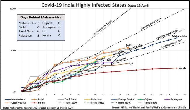
If we look at the state-wise numbers and growth charts, a clearer picture starts to emerge. We see most of the states bunched around the four-day doubling rate trend line, which is also the national average. Only Kerala seems to have flattened the curve.
Kerala was the early leader in COVID-19 cases due to its close ties with the Gulf countries and the heavy traffic of overseas migrant workers from there. The Kerala Government took an early lead in recognising the severity of the epidemic and set up a clear road map for tackling it. This included extensive testing and contact tracing of foreign-returned travelers. Till March 31, while the rest of the country averaged 32 tests per million people, Kerala had conducted 212 tests per million people with Delhi a distant second, with 114 tests per million.
These aggressive steps along with a comprehensive relief package, announced for all residents and migrant workers in the state, has ensured that Kerala flattened the curve, got the epidemic under control while also ensuring the people are taken care of and treated humanely.
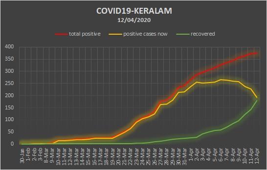
The standalone chart of Kerala with current positive and recovered cases, more clearly illustrates Kerala’s success in not just flattening, but also bending the curve. Kerala had, as of April 12, as many as 194 active cases, 179 recovered cases and two deaths. The very low death to total closed case ratio of 1.1% is a testimony to Kerala’s success and compares favourably to the countries being acclaimed worldwide in successfully controlling the epidemic, such as South Korea, which has a death to closed case ratio of 2.8%.
The rest of the country is still struggling with the surging numbers, as we have seen in the chart of the infected states. The testing rate has improved from a paltry 32 per million to 131 per million but still well below where it needs to be. The chart below plots the COVID-19 case numbers against the number of tests per million.
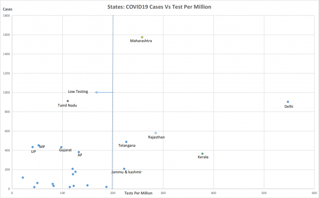
The worrisome part is that except for six states -- Kerala, Delhi, Maharashtra, Rajasthan, Telangana and Jammu and Kashmir -- the testing is still very low (below 200 tests per million) in all other states. So, the fact that states like Tamil Nadu, Madhya Pradesh, Uttar Pradesh, Gujarat and Andhra Pradesh are seeing surging numbers inspite of low testing, probably points to a far more widespread epidemic than the reported numbers suggest.
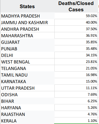
Another metric to look at, is the deaths to closed cases ratio. We have already seen that in Kerala’s case, this number is at 1.1%, suggesting that most of the infected people have been located and epidemic is well under control. The other states don’t present such a picture. As we can see from the chart below, this ratio is very high for nine states, at above 20%. This suggests that in many states the infected people are not being detected, resulting in deaths showing up as a high fraction of total resolved cases. Thus the national picture is not as sanguine as the Health Ministry or these scientists would like us to believe.
Now, what does one make of the Health Ministry’s statement that the lockdown has been effective and that without the lockdown, the country would be staring at eight lakh cases by April 15. The Secretary to the Ministry said that in the chart below, the red curve denoting no lockdown or containment “steeply rose to 2,08,544 cases on April 9 (and with a note that it would extend to 8.2 lakh by April 15); a blue, gentler curve that rose to 45,370 by April 11 (and 1.2 lakh cases by April 15), the blue indicating the situation with containment measures but no lockdown; and the final green line indicating the 7,447 cases at present.”
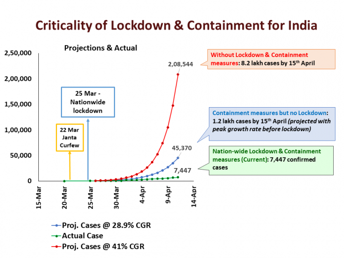
The Secretary, Lav Aggrawal, gave no further details on how these numbers were arrived at.
Typically, mathematical models are used to understand the spread of viral epidemics. There are several such models in epidemiology. The most popular ones being the SIR (Susceptible, Infected and Recovered) and SEIR (Susceptible, Exposed, Infectious, Recovered) Models. A research group at University of Basel, Switzerland, has open sourced an implementation of the SEIR Model and put it in the public domain. We used this model to see if we could reproduce these numbers.
This model has helpful templates for each country, which fills out the population figures and other control variables required by the model. One of the most critical control variable is the base “Reproductive Rate” or R0. R0 is defined as the average number of people each infected person would infect. This number needs to be obtained empirically. R0 for Wuhan, China, is now estimated at 2.7. The researchers at University of Basel put an R0 for India at 2.5. The bigger the R0, the steeper the exponential growth curve of the model. So, if you want scary numbers, then you would bump up R0. Which is what those advising the Health Ministry seem to have done, as we will see below.
In order to reproduce the curve displayed in the Secretary’s graphs, we set R0 to 3, initial suspected cases to 50 and starting date to March 1. The figure below is a screenshot of the model with these parameters and no mitigation scenario.
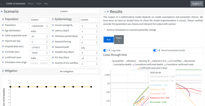
With these settings, we get 2.08 lakh cases (infectious + recovered) on April 9-- exactly as on the red line in Health Ministry’s graph. Further, the same setting will give eight lakh cases on April 15.
Now, if we change the “mitigation” setting to “moderate mitigation” in the model, we would get 52,000 cases on April 9, and 1.2 lakh cases on April 15 - closely matching the blue line in the Ministry’s graph and corresponding to the containment but no lockdown scenario.
The green line of actual cases in the graph, is not from the model but the actual cases as tested and reported by Health Ministry.
It should be noted that these figures are purely what a mathematical model produces, given the input parameters selected. One could select higher R0 values to get more scary figures or lower R0 values to get more benign figures. Unless the value of R0 and other variables is empirically determined using a large scale study, the numbers have no predictive value but should merely be used to understand the exponential growth nature of an epidemic. Given the extremely low level of testing in our country, we clearly don’t have enough data to state with any level of confidence, that India’s R0 will be higher than Wuhan, or what the researchers at University of Basel have guessed.
The Ministry, probably, rightly doesn’t take these numbers too seriously and these were really only for propaganda purposes. The ruling Bharatiya Janata Party’s IT Cell chief, Amit Malviya, has been sharing such numbers in his tweets much before the Health Ministry put them out. It is reassuring to know that the government, on the other hand, is well aware of the gravity of the epidemic and is bracing for a surge in numbers in the next few days, as yet another report, quoting the same Secretary to Health Ministry, Lav Agrawal, suggests.
Get the latest reports & analysis with people's perspective on Protests, movements & deep analytical videos, discussions of the current affairs in your Telegram app. Subscribe to NewsClick's Telegram channel & get Real-Time updates on stories, as they get published on our website.