Time to Replace ‘Rainbow Colour Scale’ for Data Visualisation?
Visualisation is of great importance for the interpretation of any kind of data. Coloured representation is aimed to make the interpretation and processing of the data easy and robust.
But can colours be misleading? Can one end up drawing a conclusion, which, in no way, it is intended to be conveyed? The answer is yes, it can. Given the popularly used ‘rainbow scale’ in most of the visualisation softwares, misinterpretation of the visual data has become a not-so-uncommon phenomenon. The ‘rainbow scale’ is also problematic for the colour-blind people, who can’t decipher the meaning of certain colours. In fact, the concern against the use of ‘rainbow scale’ is growing among the climate scientists, doctors, population scientists, as well as people suffering from colour-blindness. To combat the problems with the rainbow scale, scientists have recently developed a new model named ‘cividis’. Developed with the help of computer simulations and mathematical modelling, ‘cividis’ uses only two colours – blue and yellow – with a clear brightness and hierarchy. In their analysis of the yeast cell and fluid flow (fig1) using this colour scale, people can perceive the brightest yellows as peaks and the darkest blues as lows. The benefit of replacing the multicoloured rainbow scale by the other simpler colour scheme could be seen in medical diagnostics as well. In one Harvard University study, researchers worked on developing models for arteries where they replaced the conventional 3D model using the rainbow scale by a 2D computer model using a red-to-black colour scale. The accuracy of diagnosis of heart diseases rose from 39 per cent to 91 per cent.
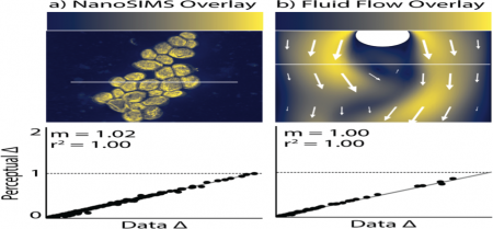
Fig 1: Imaging yeast and fluid flow using cividis
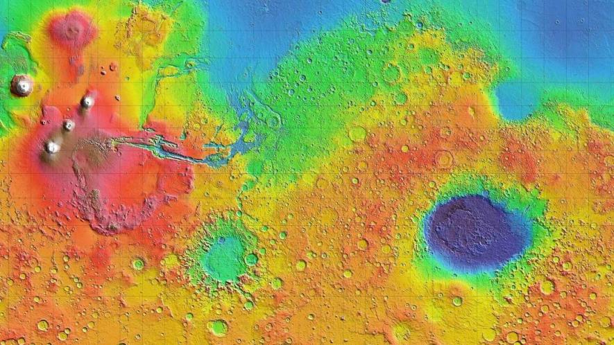
Rainbow colour scale is based on the pattern of colours that appear in a rainbow. The pattern consists of seven hues (colours) of different wavelengths, and with the same order as it appears in the visible spectrum of light. The “Roy G. Biv” name associated with this scale represents the sequence of light, which is: Red, Orange, Yellow, Green, Blue, Indigo, and Violet. Use of this scheme of colour for visual representation has been ubiquitous in almost every field of science, where everything, starting from brain activity mapping, to global environment, to the topology of the Mars has been depicted using different colours. But why is the rainbow scale being adopted for such a large variety of scientific data presentation? Well, because it catches the eye. With all the standard colours present in this scale, it becomes a natural choice for data visualisation.
Several reasons are there that make the rainbow colour scale problematic. The first problem is its inability of ordering the colours. Let’s take an example with the following figure (fig2) of colour balls where grey-coloured balls with increasing darkness are taken in one hand, and in the other hand, different colours are taken. Ordering the colour balls with a single colour of different contrast is easy; either they can be put in dark-to-light order or reversely in the light-to-dark order. But when it comes to ordering of the balls with different varieties of colour, different responses from individuals will surely emerge. Now what problems can the anomalies of ordering the colour pose in interpretation of data? Visualisation is aimed to tell the story that the changes in data have to say. Precisely, the complex pattern hidden in the data should become easier to decipher with a glance over the visual presentations. With the anomalies in putting the rainbow colours in order, the interpretation can be misleading, especially in continuous data. Using colour gradients with single colour is obviously easier to categorise continuous data from highest to smallest or vice versa.
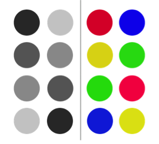
Fig 2: to depict the differences in ordering colour using different colour scheme.
The other problem with using the rainbow scale arises, as it can create false boundaries. This arises because human eyes are not very much good at detecting the narrow edges of different colours put side by side. Human eyes have different sensitivities towards different wavelength of light. One example here will be of great help. The figure (fig3) below shows different zones of the ozone layer carried out in a study in 2006. Clearly enough, the boundary between the yellow and green regions depicting as the two different layers, are visible. This boundary was highlighted in blue colour as in the figure.
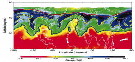
Fig 3: Ozone layer zones are represented using rainbow colour scheme
The visual data, when reanalysed in another study, brought out something very interesting. When reanalysed using the rainbow scale and using a different colour scheme, different visuals appeared out of the same data. Differences in visuals can be seen in the figure (fig4) below. The left panel depicts the rainbow colour scale while the middle panel depicts the analysis done on the sequential scale. In the sequential scale, colour is used with its gradient, with darker portions showing larger gradients. The yellow mid portion in fig3 above is visible in the dark portion with larger gradients, but the blue line separating yellow and green portion in fig3 is far less visible.
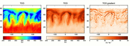
Fig 4: Ozone layer zones are represented using rainbow colour scheme (left) and using sequential colour scheme (right)
What does this tell us? This points towards the fact that by using the rainbow scale, artificial boundaries between colours can get created, which might not necessarily be representative of the actual data. Other examples highlighting the anomalies created by rainbow scale in deciphering the meaning of visual data are also coming in. The misinterpretation is due to the perceptual non-uniformity inherent in the rainbow scale that can cause sharp false boundaries between colours, which is an outcome of the visual processing of the human brain.
In cividis, the developers took an existing colour scale and simulated what it should look like to the red-green colour-blind people. Their simulation took care about the steady change of colour and brightness throughout the scale only to ensure accurate representation of the data. By intense mathematical optimisation of their scale, they could bring perceptual consistency among the people – who are colour-blind and those with normal colour vision as well. Cividis can also solve the problem of falseboundaries seen in the rainbow scale. The actual changes in the data are well-represented, and in accordance with the perceived changes in hue and luminance.
Unlike the rainbow scale, using lesser colours and a simpler way of representation in developing a colour scale might be the way out in enhancing visual data interpretation for both normal and colour-blind people.
Get the latest reports & analysis with people's perspective on Protests, movements & deep analytical videos, discussions of the current affairs in your Telegram app. Subscribe to NewsClick's Telegram channel & get Real-Time updates on stories, as they get published on our website.